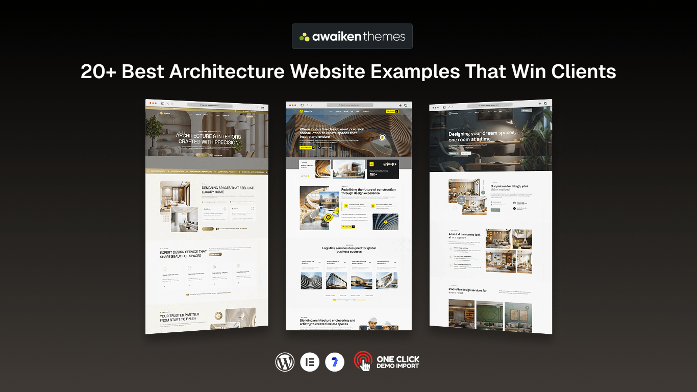
Is your architecture website as impressive as the buildings you design?
Your website is often the first place potential clients see your work and decide whether your firm is worth contacting. A slow, outdated, or confusing site can make even great architecture easy to overlook.
The best architecture website examples show that you do not need a huge budget to stand out. Strong project photography, simple navigation, a well-organized portfolio, and clear calls to action can make a big difference.
In this guide, we’ll explore 21 architecture website examples and highlight the design ideas you can use to create a professional, client-winning website of your own.
By the end, you’ll know exactly what makes an architecture website stand out and how to turn those ideas into a website that helps bring in more clients.
What Makes an Architecture Website Win Clients
We selected every site using the same seven checks. These are the key things we looked for in all 21 architecture website examples below.
- Photography that showcases your work: Visitors decide within seconds whether to stay. Your first image plays a big role, so use high-quality, professional photos of your projects.
- A portfolio clients can easily explore: Filters for building type, location, or year help visitors quickly find projects similar to theirs. Without them, your best work can get lost.
- Pages that load quickly: Architecture websites often use lots of images, which can slow them down. Compress your images and keep galleries optimized so visitors do not leave.
- A design that works on mobile: Many clients will visit your site from their phones. Make sure your images, project grids, and pages look good and work smoothly on smaller screens.
- Simple navigation: Visitors should be able to find important pages without confusion. Keep your menu clear and make key information easy to reach.
- An easy way to contact you: Add a clear contact prompt at the end of every project page, not just in the footer. Keep your contact form short and simple.
- Proof that builds trust: Awards, client testimonials, team photos, and recent updates show visitors that your firm is experienced, active, and trustworthy.
Now that you know what separates a strong site from a weak one, let us walk through the architecture website examples that get it right.
21 Best Architecture Website Examples That Win Clients
We have ordered these architecture website examples from global practices down to solo architects. That way you see the standard being set, then watch smaller studios reach it on a fraction of the budget. Each one earns its place for a different reason.
1. Foster + Partners
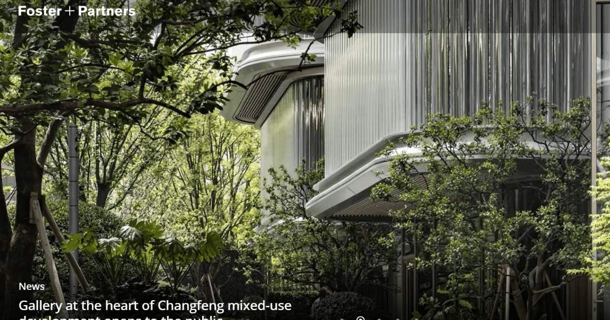
Foster + Partners runs one of the largest practices in the world. The site is built for clients arriving with a very specific brief, so projects can be browsed by sector, scale, and location.
A hospital client never has to scroll past forty airports to reach relevant work. Sustainability gets its own space because clients ask about it now, and the office locator quietly reinforces the practice’s reach.
What works: Sort your projects by the categories your clients search for, not by the order you finished them.
2. Bjarke Ingels Group
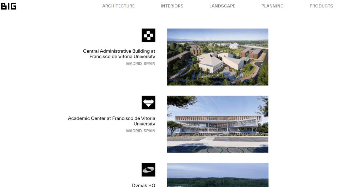
BIG treats its portfolio as one continuous story rather than a filing cabinet. Each project opens with a cinematic image, then walks you from the first idea through to the finished building.
That matters because clients are not only buying a building. They are buying a way of working, and sketches, models, and videos sit beside the polished photography to prove the process is genuine.
What works: Show two or three sketches from your own process. Clients trust a firm that lets them see the thinking behind a result.
3. Zaha Hadid Architects

Some sites describe a firm’s style, and this one performs it. Curved image masks, fluid layout grids, and a mostly black palette carry the same language as the built work.
The high contrast does a real job here. White architecture pops against dark backgrounds, and a research section gives the practice room to show depth beyond completed projects.
What works: Let your site borrow one signature element from your architecture, whether that is a curve, a material or a single colour.
4. Snøhetta
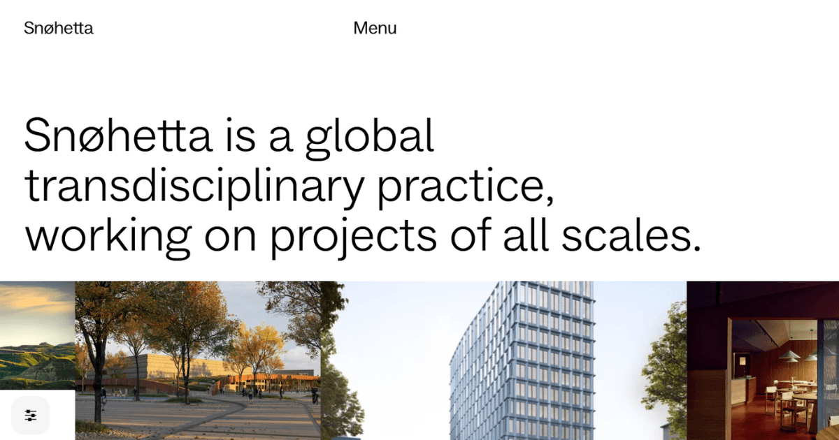
Snøhetta works across landscape, architecture and interiors, and the site refuses to separate them. Photography runs edge to edge, navigation stays quiet, and the typography never competes with the images.
This reads as confidence more than restraint. When projects are strong enough to hold attention alone, a busy interface only gets in their way.
What works: Remove one element from your homepage this week. Most architecture website design improves the moment something comes off the page.
So far, these architecture website examples share one habit, which is trusting the work to hold attention. The next few show what happens when a firm adds personality on top of that.
5. Heatherwick Studio
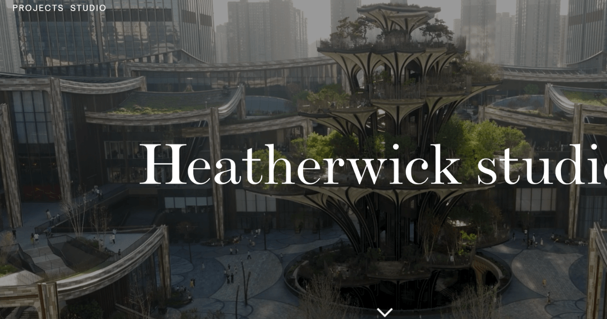
Heatherwick leads with motion. The homepage runs a full-screen reel of the studio’s most striking work, so you feel the scale before reading a line of copy.
Scroll past it, and the site settles into a clean project grid. Process models sit inside the project pages, and an ideas section covers thinking that was never built.
What works: If your projects film well, put video first. If they do not, skip it rather than filling the gap with stock footage.
6. OMA
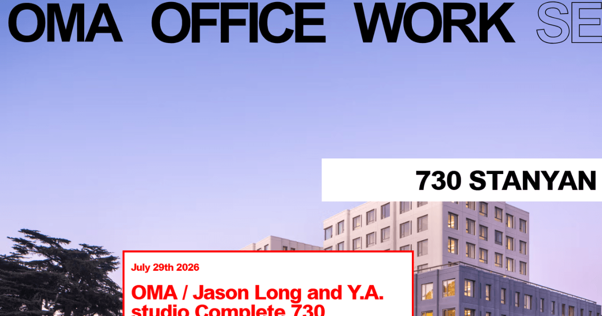
OMA has gone the other way and stripped almost everything out. You get a plain list of projects, a news feed, and very little decoration.
That is a deliberate choice from a practice with nothing left to prove. The chronological archive reads like a searchable history of the office, and reaching a project takes seconds.
What works: A simple list beats a slow gallery. Speed and clarity win more enquiries than animation ever will.
7. Herzog & de Meuron
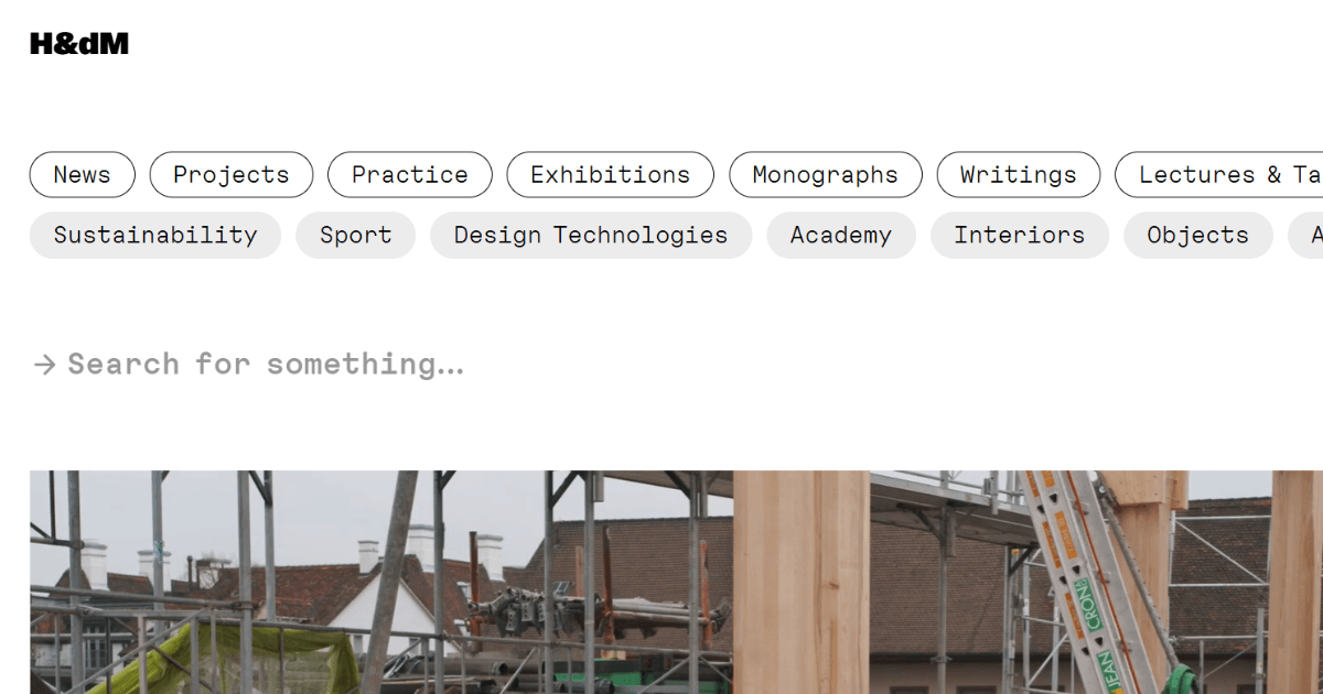
This site behaves like a quiet archive. White space, minimal type, and large images dominate, and every project carries a number so the work reads as one continuous record.
What lifts it above the rest is the news feed. Site visits, openings, and awards appear regularly, which tells a visiting client the practice is busy right now.
What works: Publish something small every month. An active news page is the cheapest proof that your firm is still building.
Also Read: 15 Best Personal Portfolio WordPress Themes to Showcase Your Creative Work
8. MVRDV
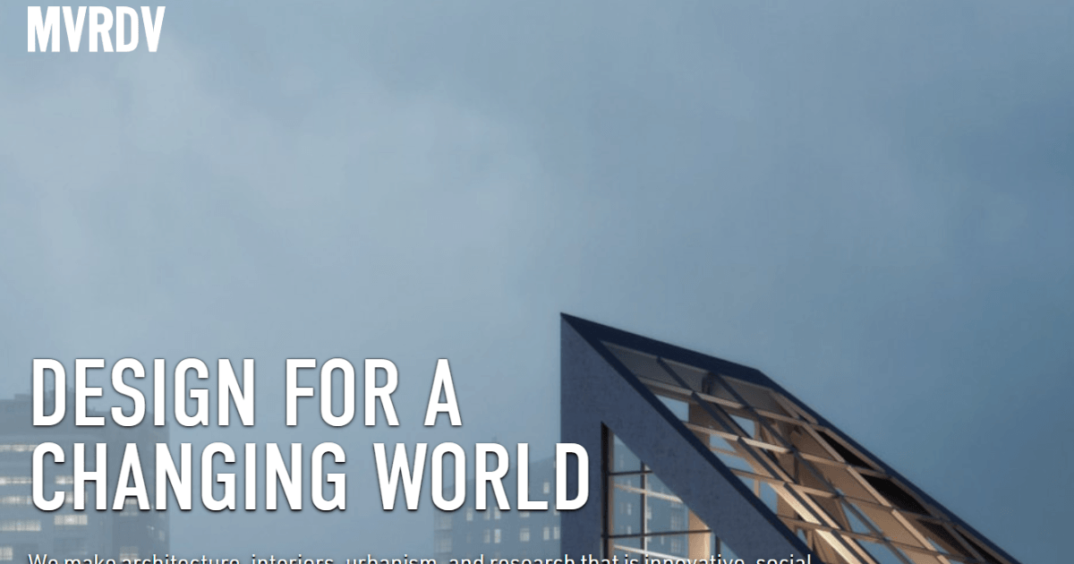
MVRDV builds bold, sometimes playful buildings, and the site matches that energy. Colour blocks code the different project types, and the layouts break the usual grid on purpose.
The about page is the real surprise. It reads more like a manifesto than a corporate biography, so you know exactly what working with this practice would feel like.
What works: Write your about page in your own voice. A generic mission statement gives a client nothing to respond to.
9. UNStudio
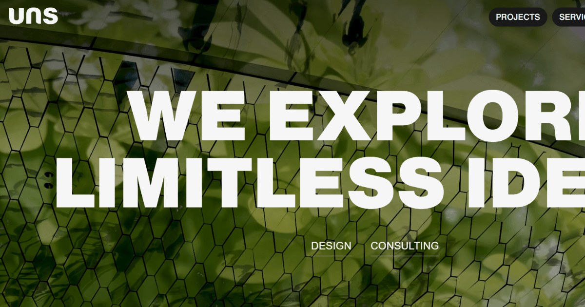
UNStudio uses motion and geometry throughout. A dynamic project carousel anchors the homepage, and an interactive map shows the practice’s global reach at a glance.
The team page does the heaviest lifting. Hundreds of people appear with photographs, which answers a large client’s unspoken question about whether the firm can carry the workload.
What works: Show your whole team, even if that team is three people. Faces reassure clients faster than paragraphs do.
10. Gensler

Gensler’s site is built for business rather than for design awards. Navigation stays clean, services are stated plainly, and case studies are grouped by industry.
A hotel client therefore lands on hotel work. Published research sits alongside the portfolio, which positions the practice as an adviser rather than a supplier.
What works: Group your work by your client’s industry rather than by your internal project names.
11. Perkins&Will
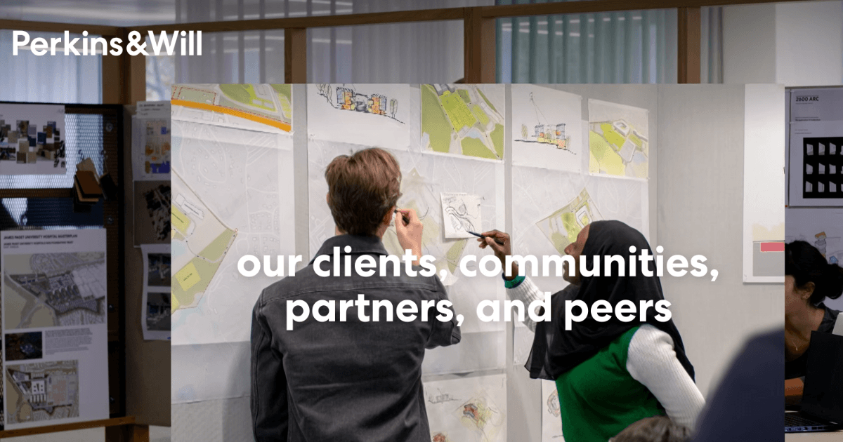
There are no clever animations here and no scroll tricks. You get a full-width image of a strong building and a page that scrolls calmly downwards.
Further down you meet what the practice stands for, a handful of its best projects and a spotlight on individual designers. The whole thing loads fast and never asks the visitor to work.
What works: Simple still converts. A plain site with excellent photography beats a clever site with average photography.
Notice that none of these architecture website examples lean on effects to persuade anybody. The firms that follow lead with values and plain clarity instead.
12. Studio Gang
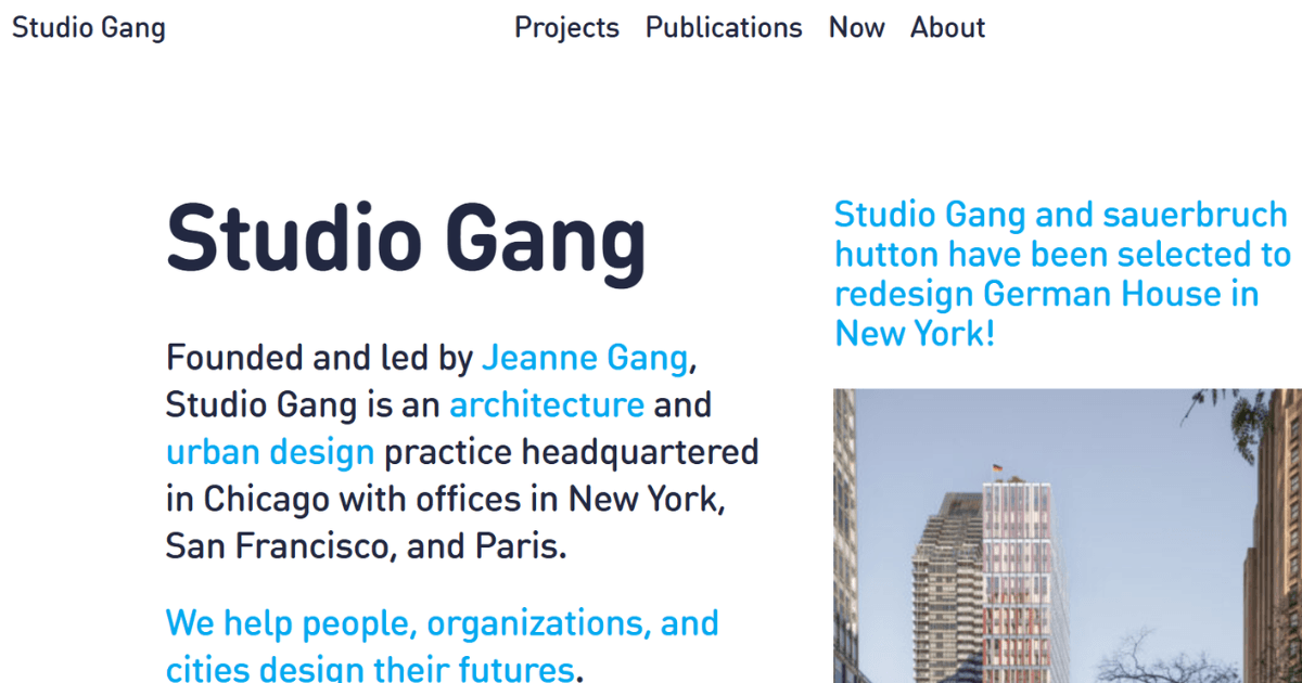
Studio Gang leads with what the practice believes rather than what it has built. Sustainability, public engagement, and community sit near the top, and the projects then prove those commitments.
That order acts as a deliberate filter. Clients who care about the same things stay and read, and those who do not quietly move on.
What works: Say what you care about before you show what you have built. The right clients respond to that.
13. Olson Kundig
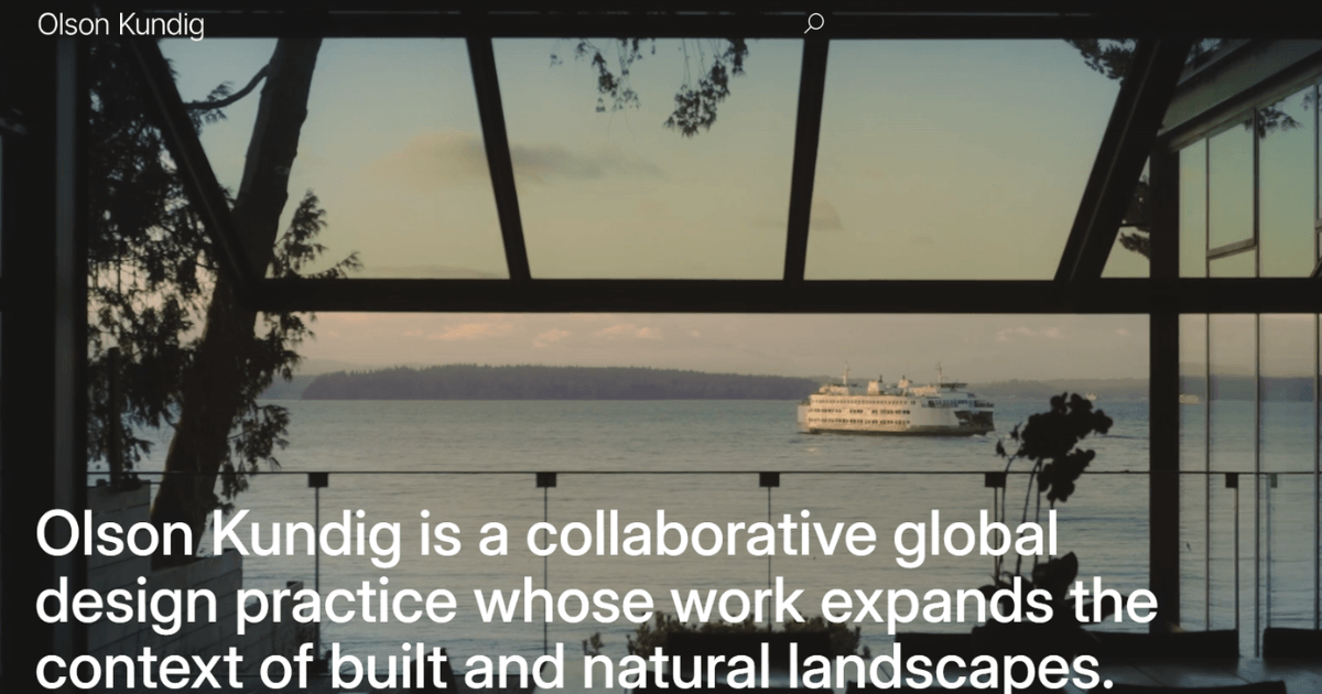
The Olson Kundig homepage is almost entirely photographs of finished work. Every one of them is clickable, and each carries a project name and a location.
That small labelling habit removes genuine frustration. Visitors never have to guess whether an image is a photograph or a render, or where the building actually stands.
What works: Label every image with the project name and location. It costs nothing and answers a question your visitor already has.
14. CO Architects
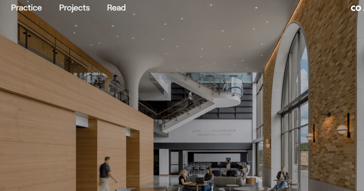
CO Architects puts a national award straight above the fold. It sits in white type across two of the firm’s strongest projects, so credibility lands before you scroll.
The homepage then alternates between solid colour panels and full project images. The closing call to action carries real personality, which is rare on an architecture firm website.
What works: Lead with your single strongest credential, then write a call to action that sounds like a person wrote it.
Also Read: Best Building and Construction WordPress Themes for Modern Websites
15. Moody Nolan
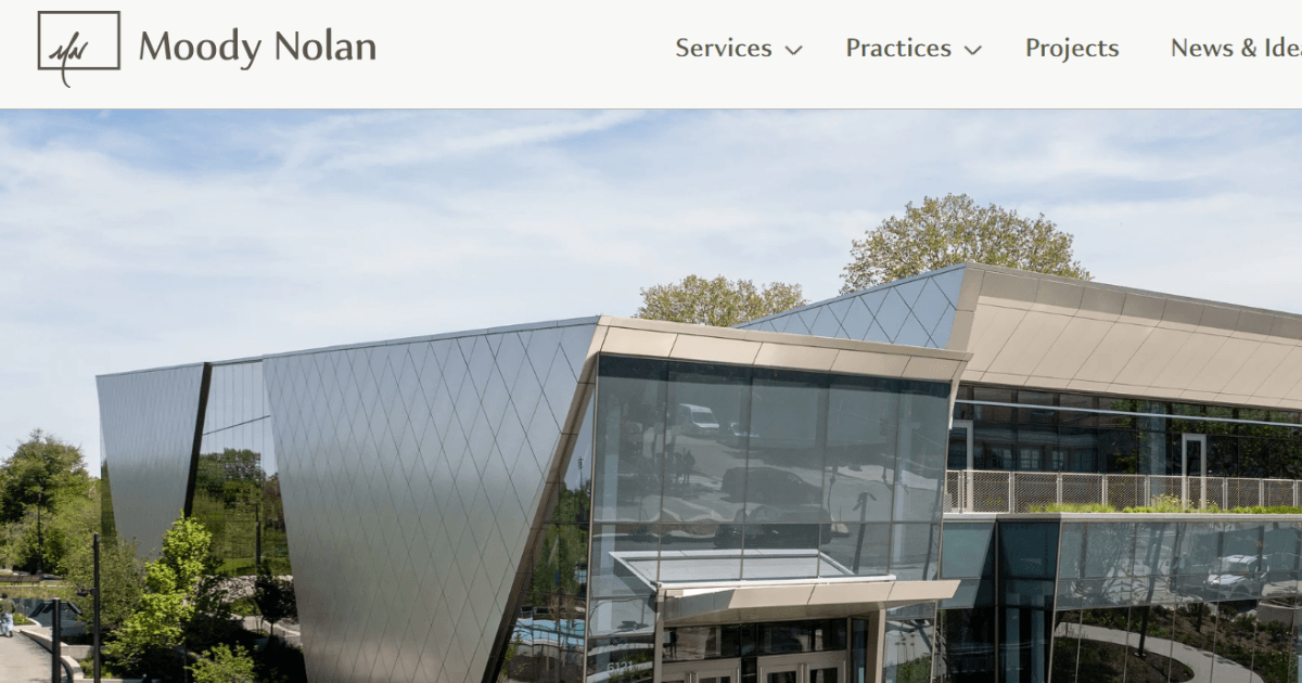
Moody Nolan stacks everything a prospective client needs onto a single homepage. Full-width project images sit at the top, followed by the mission, the design philosophy, and the practice areas covered.
Awards close the page and do the trust work. Dark text on a clean white background keeps the experience calm, so nothing pulls attention away from the buildings.
What works: One well-ordered homepage can replace five thin pages. Lead with work, follow with philosophy, finish with proof.
16. Conran & Partners
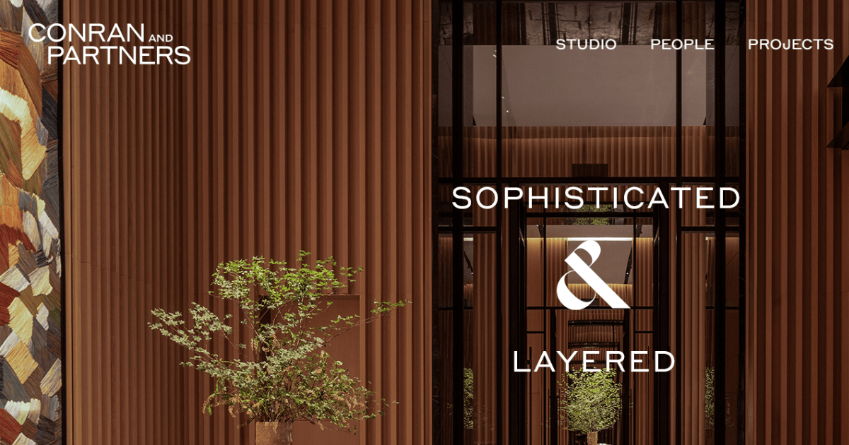
Conran & Partners makes its two services obvious immediately. Architecture and interior design each lead straight to relevant project pages, so nobody has to guess what the practice does.
The Studio and People sections are the standout. One shows the office itself and the other shows the designers behind the work, which turns a firm into a group of humans.
What works: Name your services in the main menu. Clarity beats cleverness when somebody is deciding whether to call you.
17. Minale + Mann
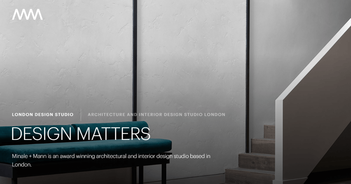
Minale + Mann proves a smaller practice can compete on craft alone. The site is minimal and streamlined, with visual navigation and animations that guide you rather than show off.
It has also been built to be found. Solid search performance sits underneath the design work, which is the part most award-winning architect website design quietly forgets.
What works: A beautiful site nobody finds wins nothing. Build for search as carefully as you build for looks.
18. William Rawn Associates
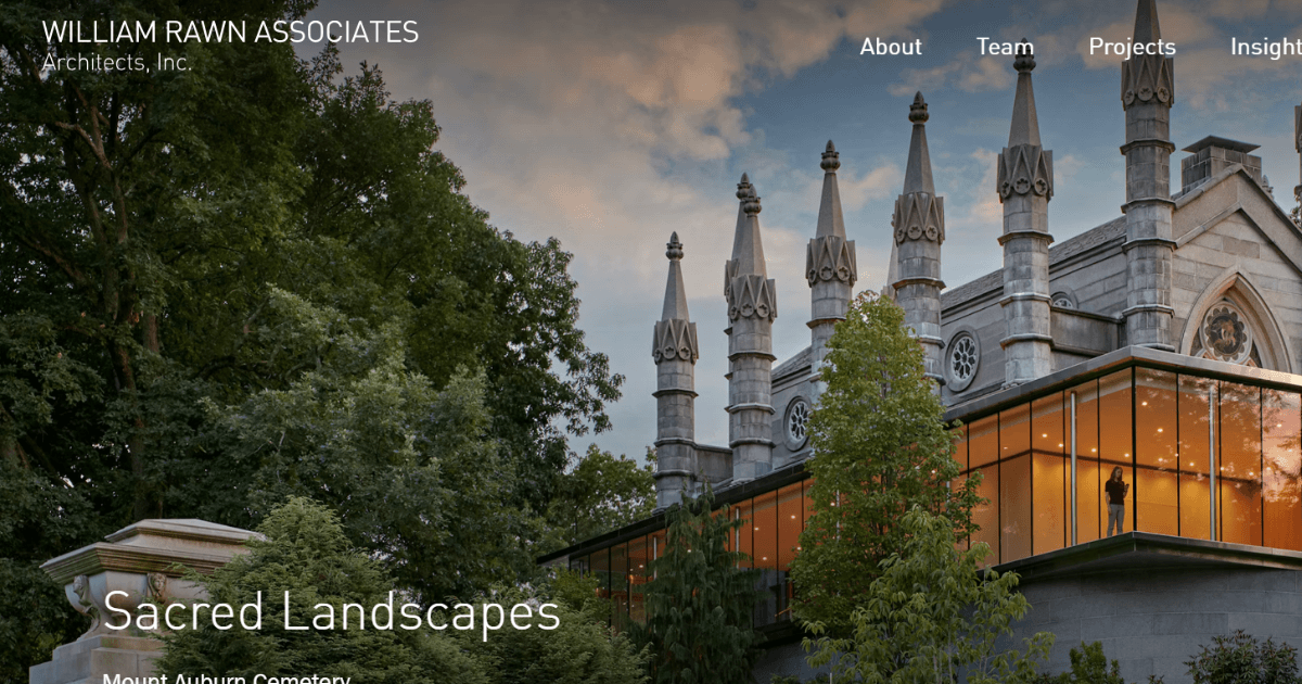
The William Rawn Associates homepage opens with a slideshow introducing the team alongside completed buildings. You meet the people and the work at the same moment.
That pairing settles a question early. A visitor sees genuine expertise and a real group of architects at once, and starts trusting the practice immediately.
What works: Put your team into the homepage slideshow. Buildings show competence; faces show who a client will actually deal with.
Also Read: Best Architecture and Interior Design Websites Templates
The final three architecture website examples come from small and solo practices. They matter most to you, because their budgets look a lot like yours.
19. Robert Gurney Architect
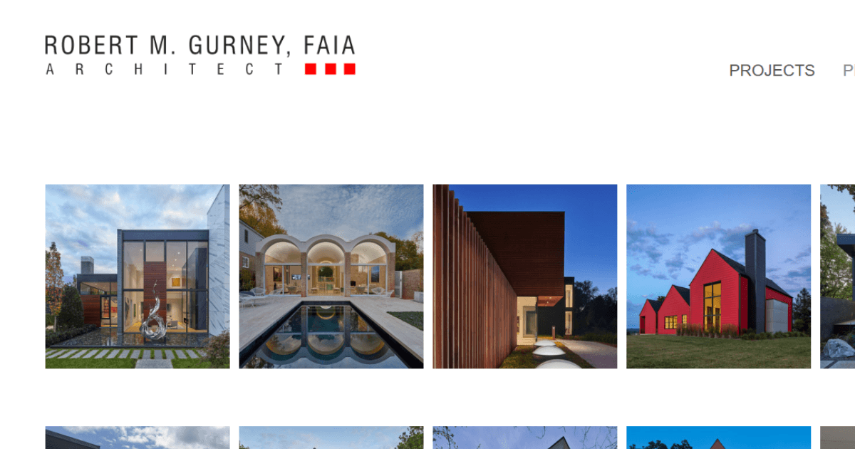
Robert Gurney borrows the way photographers use social media. The homepage is a clean grid of project images with generous white space and almost nothing competing for attention.
For a solo architect or a very small studio, this is the model to copy. It costs little to build, it loads quickly, and it puts the work at the centre.
What works: A simple image grid is enough. Put your budget into photography rather than features you will never use.
20. Yellow House Architects
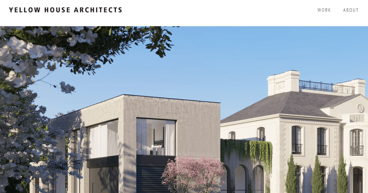
Yellow House Architects greets visitors with the team’s faces and a clear statement of what the practice stands for. The welcome feels warm rather than corporate, and the navigation stays simple.
This is a genuine advantage small firms hold over large ones. A big practice cannot introduce everybody, while a small studio shows the exact people handling your project.
What works: Use a real team photograph instead of a stock image. Being small is an advantage once you show it properly.
21. MLA Architecture
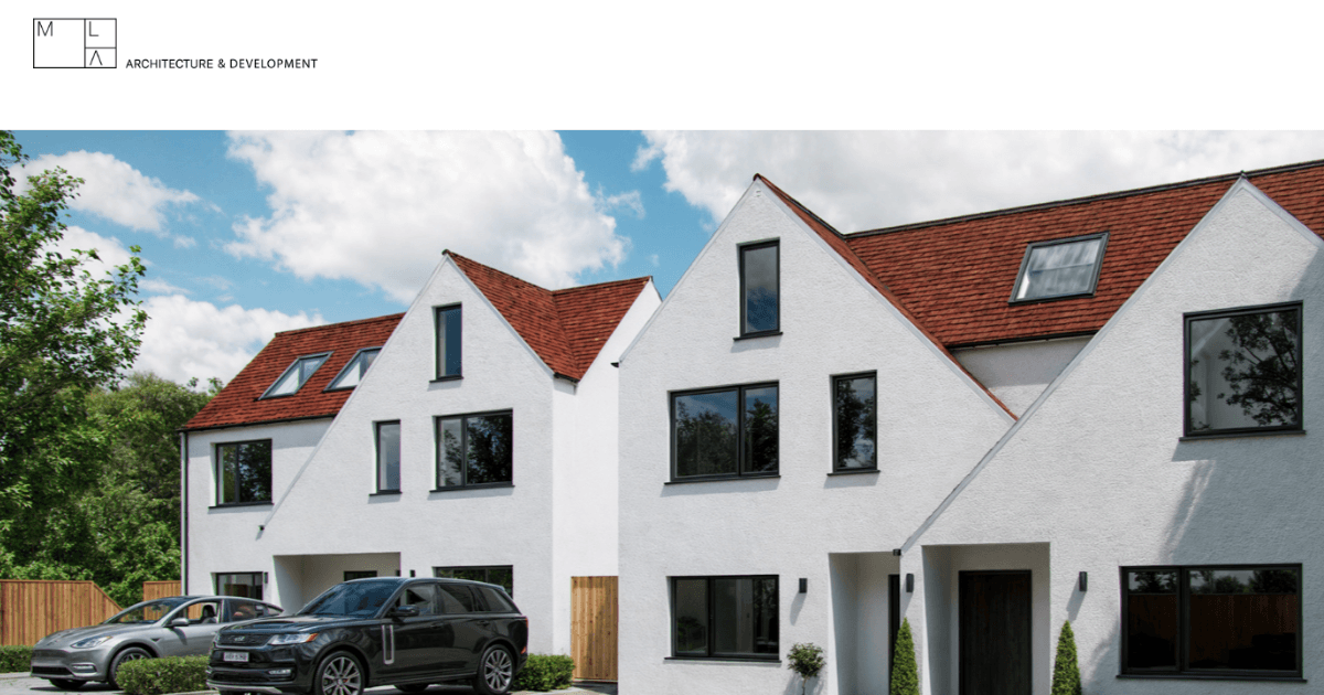
MLA Architecture opens with completed projects that make the practice’s range clear straight away. The palette stays in whites and greys, and browsing feels effortless from the first click.
Nothing on the site is showy, and it is stronger for that. A compact architecture portfolio website presented with this much care reads as considered rather than thin.
What works: Restraint makes a short portfolio feel deliberate. Show eight strong projects rather than twenty average ones.
Want to Build an Architecture Website Like These?
You’ve seen 21 architecture website examples that get the key details right. Now, here’s the good news: you don’t need a custom designer or months of development to create something similar.
A purpose-built WordPress theme gives you the right structure from the start. Add your projects, photos, team details, and branding, and you’re ready to go.
The themes below already include the essentials, from strong hero sections and project galleries to clear contact options.
Quick 3 Picks: Best Architecture WordPress Themes for Firms and Studios
Here are three WordPress themes worth considering for architecture practices and design studios:
 First choice First choice |  Second choice Second choice |  Third choice Third choice |
|---|---|---|
| Luxine – Architecture & Interior Design WordPress Theme | Renovex – Construction & Architecture WordPress Theme | Inspaire – Interior WordPress Theme |
 |  |  |
| Popularity: Elite Author on ThemeForest with 17,000+ sales | Popularity: Elite Author on ThemeForest with 17,000+ sales | Popularity: Elite Author on ThemeForest with 17,000+ sales |
| Rating: 4.7-star author rating | Rating: 4.7-star author rating | Rating: 4.7-star author rating |
| Built for: Architecture firms and studios, interior design agencies, landscape and urban planning professionals, construction and building design companies, furniture portfolios | Built for: Construction companies and building contractors, architecture firms and architectural designers, renovation and remodeling providers, property developers, engineering and structural consulting firms | Built for: Interior designers, architects, home decor stores, furniture shops, creative agencies |
| Ready-made pages: About, Services, Service Details, Projects, Project Details, Team, Pricing Plan, Testimonials, Image and Video Gallery, FAQs, Contact and Blog | Ready-made pages: About, Services, Service Details, Projects, Project Details, Team, Pricing Plan, Testimonials, Image and Video Gallery, FAQs, Contact and Blog | Ready-made pages: Multiple project showcase layouts for interior and architectural work, with the full demo site importing in one click |
| Design control: Home with three unique layouts, plus global control of fonts and colors from one panel | Design control: Home with three unique layouts, plus customizable header and footer to match your branding | Design control: Retina-ready visuals with fonts, colors, and layouts editable throughout |
| Easy to Customize: Edit everything with Elementor. No coding skill required | Easy to Customize: Edit everything with Elementor. No coding skill required | Easy to Customize: Edit everything with Elementor. No coding skill required |
| One Click Demo Import: Import the complete website within minutes | One Click Demo Import: Import the complete website within minutes | One Click Demo Import: Import the complete website within minutes |
| Built to be found: SEO optimized structure, responsive layout, Gutenberg-optimized, works with WPML and Contact Form 7 | Built to be found: SEO optimized structure, responsive layout, Gutenberg-optimized, works with WPML and Contact Form 7 | Built to be found: SEO optimized structure, responsive layout, Gutenberg-optimized, works with WPML and Contact Form 7 |
| Lifetime free updates: Receive every future update at no extra cost | Lifetime free updates: Receive every future update at no extra cost | Lifetime free updates: Receive every future update at no extra cost |
| Price: $49 for one website, with lifetime free updates | Price: $49 for one website, with lifetime free updates | Price: $49 for one website, with lifetime free updates |
| See it live: Live Preview | See it live: Live Preview | See it live: Live Preview |
Build a Professional Architecture Website Without the Hassle
A great architecture website does more than showcase beautiful projects. It helps potential clients understand your work, trust your expertise, and take the next step.
The 21 architecture website examples in this guide show that strong photography, simple navigation, a focused portfolio, mobile-friendly design, and clear contact options can make a big difference.
You don’t need a complex custom website to get started. Choose the right architecture WordPress theme, add your best projects and branding, and build a website that represents your firm as professionally as your work.